Clothing labels can be small art works in their own right. Each has its own story, but would, in the normal course of events, be disposed of with the worn garment. Some from the more quality end of the clothing industry, and accessories, tell tales, which also allow for the viewers own interpretation.
Five labels in particular caught my attention, careful consideration, exploring many initial ideas, three distinct pieces developed.
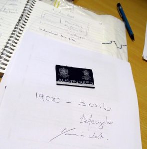
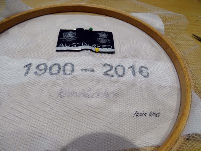
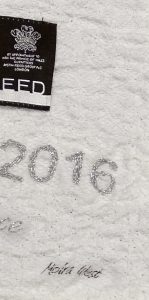
Austin Reed, a business which developed a well-loved and particular style of quality tailored clothing. In 2016, after more than a hundred years, they closed down. My ideas, conversations and notes informed the use of the word ‘Reminiscence’ to incite a human emotion and interpretation which I could use together with left over materials. Reusing and giving adding meaning and texture.
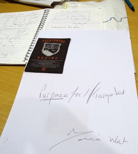
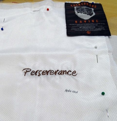
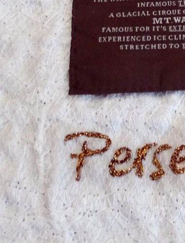
Tuckerman’s Ravine, a label from a fully waterproof jacket designed to take on the rough New England winters. The name is from The White Mountain National Forest, home to the infamous ‘Tuckerman’s Ravine’: a glacial cirque on the south east face of Mt Washington. The only word which could be used to link this with and gain an emotional response would be ‘Perseverance’. The implication is that only the truly hardened would accept this challenge.
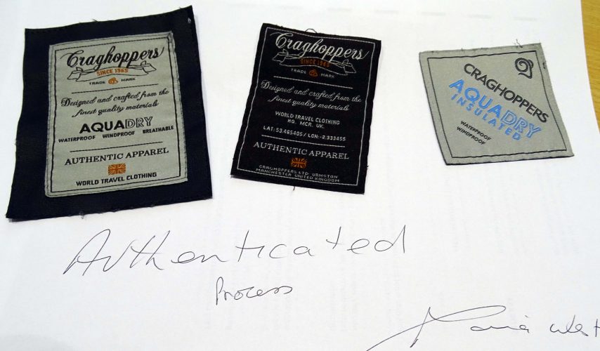
Craghoppers pride themselves on providing customers with travel clothing to compete with the elements. That is why they manufacture jackets with innovative fabrics and materials. They are made with a traveller’s pursuits in mind, for ease of movement and durability so that you can rely on your jacket when you need it most. So many delicious labels were available, and I have selected these three, quite different but beautifully crafted labels, which also give an indication of the organisations progression over the years. Not only has the brand endured but they are aimed at assisting the customer to endure the elements and enjoy the great outdoors. This has led me to one word ‘Endurance’, which could quietly but forcibly present a new art work incorporating original artistry and confidently branded with the British flag. Together with the latest label design, this is more condensed, with a neutral colour and bold lettering. Each woven label is made from different materials, and is, I feel a strong representation for the brand, which has survived for more than fifty years.
I would use the same materials and techniques for all three pieces, although the metallic threads are different gauges and colours – silver, copper and gold. Freeform machine stitching and hand stitching – integrating the old and the new by adding meaning through the use of one word to describe the feeling applied to each of the organisations creations.
The work will be exhibited in September at Gallery St.Martin’s in Lincoln. The images included are intended as a taster, a small part of the new work. Several felt pieces are also in the final stages, incorporating many techniques. I am trying to produce a series of smaller pieces, something which does not come easily. My designs sometimes take on a life of their own.
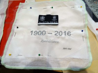
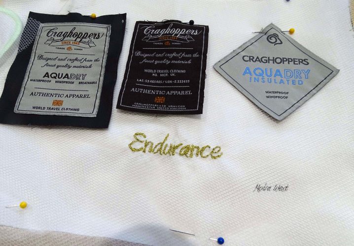
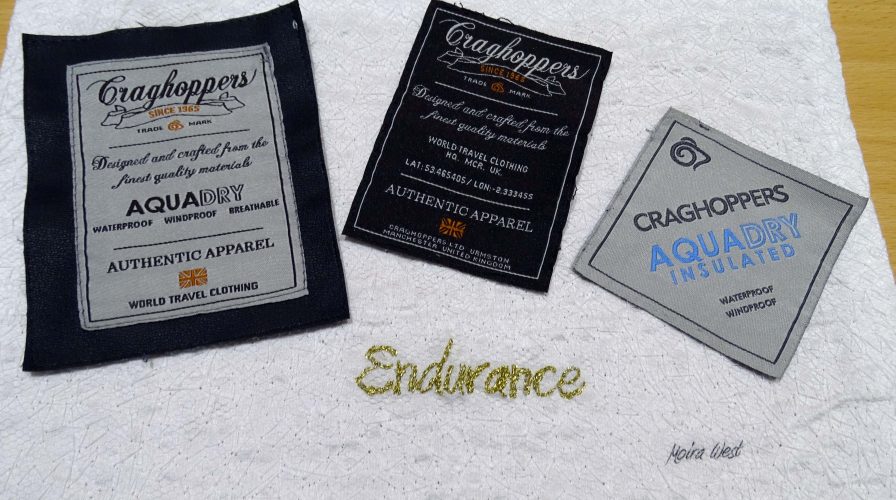
Framing completed these are now stored for the September show at Gallery St.Martin, Lincoln.