Design Source
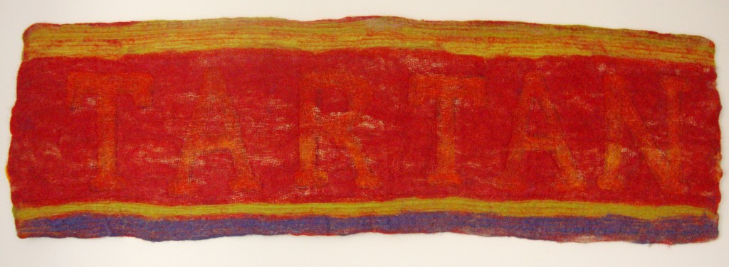
Inspired by the colour and variety of tartan, and natural breaks and pauses found in poetry, which provided the challenge for this 2011 work and the further development of my work relating to human characteristics.
Materials
Jute leaf sacking, seams unpicked, pre-felt/batts in reds, orange and yellows (plant dyed local wools), merino and Shetland (dark red), letters cut from black organza.
Process and Evaluation
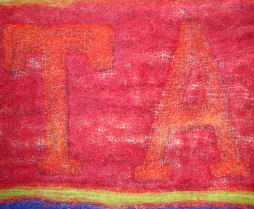
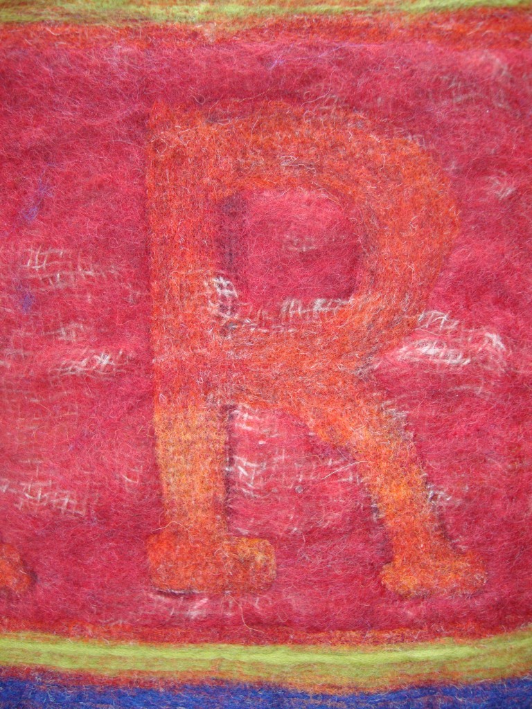
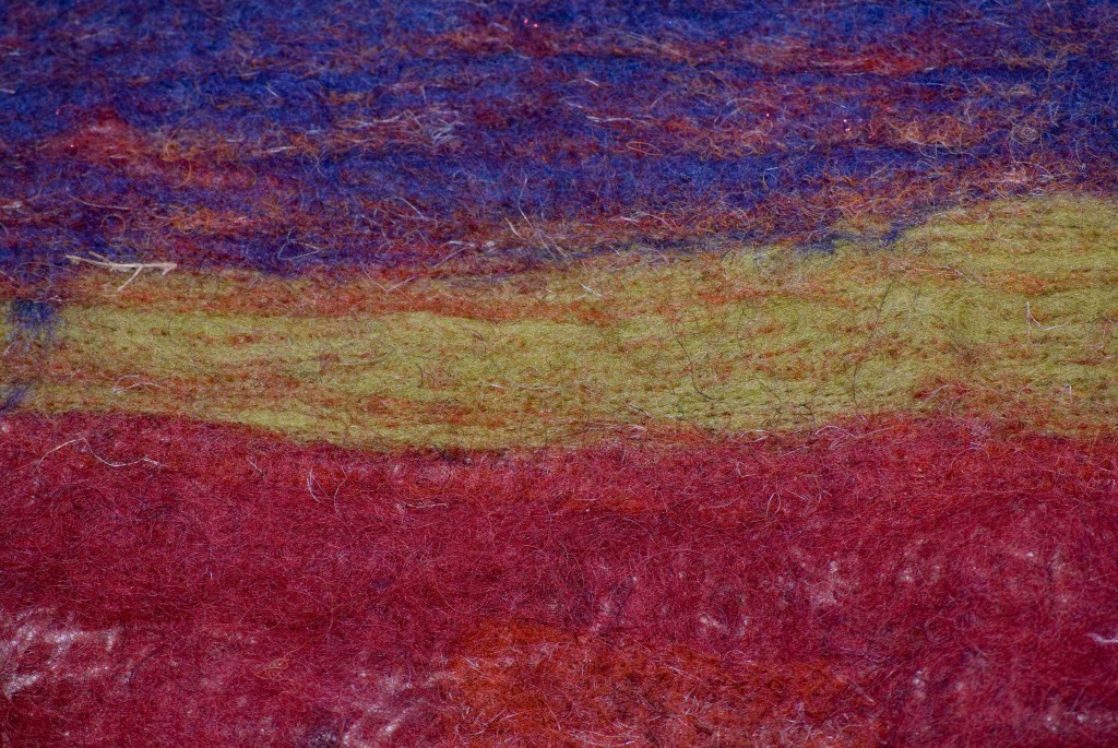
The Size and shape was dictated both by the size of the jute leaf sack, and my desire to create a panoramic section. Colours selected for the base layer were orange, a yellow line and small amount of red. The letters are spaced out on top of the base layer ‘TARTAN’ and the jute is placed on top. Red Shetland wool is thinly spread over the jute, and lines of cool yellow and purple along the top and bottom. The whole was then felted, ensuring that the jute sacking can be seen in the surface texture of the completed piece, whilst retaining the visually different sections of felt. The materials used for the letters and base layer of fibres were pulled to the front using the Embellisher machine, from back to front. A simple lined design along the top and bottom was also be embellished from front to back. This technique changes the density of the fibres, enabling the central section to remain softer than the lined edges.
Cambria typeset was selected because of the emphasis of the downward strokes on the T, templates of the letters were produced in paper to the required size, then cut from black organza – to create definition and structure for the letters as a background/tonal effect. By placing them behind the sacking the amount of black coming through to the front is effectively limited.
The embellished letters provided the desired effect, and the orange and yellow was pulled through to the front. Each letter has been worked at least twice through the needle felting process, and the end result is a subtle contrast between the red and orange as well smooth letters against the rougher red Shetland wool. Top and bottom were embellished and a little extra wool added in areas that needed a little more colour. The jute pattern adds another dimension, giving this piece a rustic look.
Canvas was selected for the backing and tabs. Bondaweb was used to hem the edges and to fix the stiffening. The tabs were completed with more Bondaweb and red ribbon. Once the tabs had been stitched onto the canvas it was ironed to provide a neat finish then signed and dated. The felt was stitched onto the backing with red cotton. A section of pole was sanded and then dyed with red ink to complete the work.
The finished felt has a relaxed and flexible look, but is firm enough to hang and full of character. Visitors were surprised by the tactile elements, complementing the visual and colour fusion.


